Your go-to resource for expert insights and carefully curated professional advice. Plan your renovation with confidence and ease
Where Did All the Color Go? The Rise of Neutral Interiors
30.06.2025, 14:23 GMT Views: 1146 Likes: 55
Quiet Tones, Loud Trend: How Interiors Became a Neutral Escape.

When we hear the word vintage, many of us picture something bold, colorful, and full of character. Old family photos show people dressed in bright yellows, reds, and greens, often surrounded by equally vibrant furniture — floral sofas, patterned curtains, deep-blue kitchen cabinets. Step into a retro diner or browse a 70s catalog, and it’s a festival of color. And yet, if we look at modern interiors today, a different picture emerges.
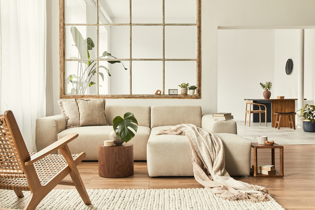
Beige, grey, off-white, muted sage, soft greige — the so-called neutral palette has quietly taken over our homes. The same is happening with our wardrobes: bright patterned shirts and color-blocked dresses are quietly giving way to beige trench coats, minimalist black outfits, and timeless, understated basics.
Entire living rooms blend seamlessly into tones of cream and light wood. Kitchens are dressed in calming whites or subtle stone hues. Even when designers talk about adding “a pop of color,” they often mean a deep navy cushion or an olive-green vase — accents so understated they barely interrupt the serenity of the space.
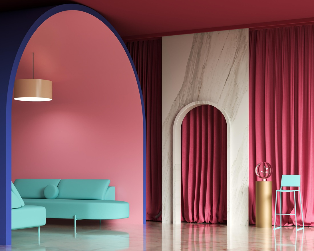
It’s not just a passing trend. Neutral colors have become so dominant in our conversations about style and interiors that the term neutral palette feels like an essential part of modern design vocabulary. But how did we get here? How did we go from mustard yellow armchairs and teal coffee tables to interiors where even adding a soft pink throw blanket feels daring?
Interestingly, this shift towards color minimalism is not happening in isolation. Several psychological and sociological studies suggest that the explosion of color in our digital lives plays a major role.
Too Much Color, But Not Where You Think
We often think of our surroundings becoming duller, but in reality, we are exposed to more color than ever before — only it's coming from the screens in our hands. From smartphones and tablets to laptops and smart TVs, our eyes absorb a constant stream of bright, saturated colors every day. Apps, notifications, social media, video platforms — everything is designed to grab our attention with bold hues and contrasts.
A 2022 global design report by Color Marketing Group pointed out that as digital life becomes more visually intense, people instinctively seek refuge in calmer, more soothing physical spaces. Interior design is reflecting this desire for balance. After hours of being bombarded with flashing icons and bright, dynamic imagery, stepping into a beige-toned living room or a soft grey bedroom provides much-needed visual relief.
Psychological Saturation from Urban Environments
Urban dwellers surrounded by bright advertisements, neon signs, and traffic lights may crave more neutral interior spaces as a refuge from sensory overload.
Moreover, minimal, neutral interiors are easier to adapt over time. A beige sofa remains relevant whether trends lean towards boho, Scandinavian, or modern minimalism. If you decide to embrace neutrals, it’s worth choosing shades carefully — richer, more complex tones like off-white, greige, or muted sage will add far more depth than plain beige or stark white.
That said, bright, playful colors still have their place — especially in children’s rooms. Studies show that colorful environments help stimulate creativity and support healthy development in early childhood.
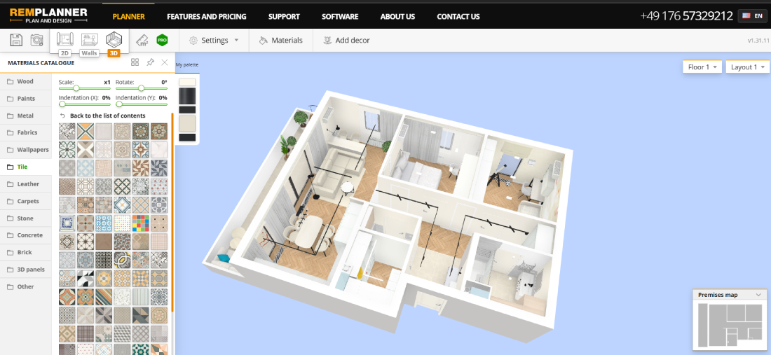
It’s no surprise that furniture catalogs now offer extensive libraries of neutral options alongside more daring, accent pieces. This gives homeowners the freedom to explore both worlds — building a calm foundation while experimenting with color through accessories, textiles, or statement furniture. Same variety of choice you can also find within the Remplanner furniture catalog. Remplanner is a great online tool for planning your interior- check it out!
The Return of Texture Over Color
As the enthusiasm for bold, saturated colors has softened in modern interiors, a new star has emerged — texture. Where once bright colors dominated, today we see spaces that rely on tactile richness to create visual interest and emotional warmth.
This shift toward texture is connected to several cultural and practical factors. Firstly, as people seek calmer, less visually noisy environments to counterbalance digital overstimulation, interiors designed purely around color can sometimes feel either too stark or artificially flat. Texture, however, adds subtle complexity without overwhelming the senses.
In the past, many mass-produced furniture and decor items prioritized smooth, glossy finishes and uniform colors that looked clean and easy to maintain. Synthetic materials like lacquer, plastic, and polished metals were popular because they were cost-effective and modern, but they lacked the natural irregularities and tactility that give spaces character.
Now, there’s a growing appreciation for natural, imperfect materials — the nubby softness of boucle fabrics, the rugged appeal of raw or reclaimed wood, the cool solidity of stone finishes, and layered textiles like woven rugs or linen curtains. These textures invite touch and bring a cozy, lived-in feeling that contrasts with the digital slickness of today’s screens.
If you’re looking to explore this trend in your own home, Remplanner offers a wide selection of textured wall finishes, floor coverings, rugs, upholstery fabrics, and other materials to help you create a space that feels both calm and full of subtle character.
Additionally, the rise of sustainable design has encouraged the use of authentic, natural materials that inherently have texture and variation, reinforcing an eco-conscious mindset. People want their homes to feel connected to nature and time, and texture helps achieve that connection in a way flat colors cannot.
Will Color Make a Comeback?
Trends are cyclical, and history shows us that periods of restrained design often give way to bursts of bold self-expression. Some design experts predict that after years of neutral dominance, we may soon see a gradual return of color — but with a twist.
Instead of the playful, maximalist approach of the past, upcoming color trends are expected to be more curated and intentional. Deep jewel tones, earthy greens, and rich terracotta are already creeping back into interiors, often combined with textured materials like wood, linen, and stone. The future of color in design is less about overwhelming vibrancy and more about depth, warmth, and character.
Designing Your Space in the Era of Color Balance
The key takeaway? Color in interiors isn’t disappearing entirely — it’s evolving. Today’s homes are designed to balance the overstimulation of our digital lives with calm, neutral foundations, enhanced by thoughtful, subtle pops of color.
If you’re planning your next renovation or furnishing project, tools like Remplanner can be invaluable. The online interior design planner makes it easy to visualize your space with different color combinations. Whether you lean towards understated neutrals or want to explore bolder, juicy accent pieces, you’ll find a wide selection of materials, finishes, and furnishings in the Remplanner catalog — all tailored to help you achieve the atmosphere you crave.
After all, your home should be your sanctuary — a place to unplug, recharge, and enjoy beauty on your own terms. And whether that means embracing the quiet luxury of neutrals or bringing a bit more juicy color back into your life — the choice is entirely yours.
 Antonella
Marconi