Your go-to resource for expert insights and carefully curated professional advice. Plan your renovation with confidence and ease
Color Contrast in Interiors
13.07.2026, 17:22 GMT Views: 915 Likes: 19
Stop Playing It Safe: A Practical Guide to Contrast in Home Design.
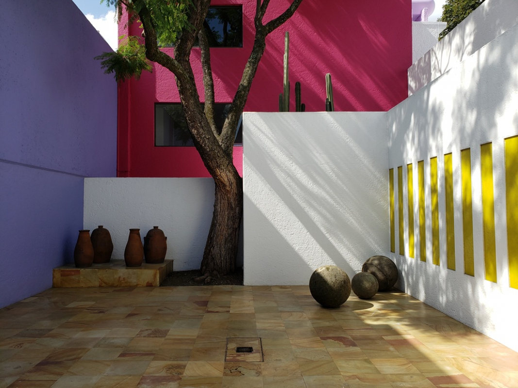
Cover Photo: Casa Gilardi, Mexico City, Mexico (1976). Designed by Mexican architect Luis Barragán, Casa Gilardi is an iconic example of how contrasting colors can shape the experience of a space. The house’s vibrant palette and masterful use of light demonstrate how color can become architecture itself — defining mood, movement, and perception within a room.
Yet despite its expressive potential, contrast is often avoided. Most people hesitate, fearing that bold combinations will lead to visual chaos or design mistakes. In reality, the opposite extreme can be just as limiting — an all-neutral, flattened interior can feel equally unresolved, only in a quieter, less obvious way. This tension between restraint and expression is where contrast becomes essential.
This guide explores how contrast actually works in interior design, breaking it down through real examples and a simple method you can apply before touching a single wall.
What Contrast Is, in Plain Language
It’s difference. Light next to dark. Warm next to cool. Rough material next to smooth. Your eye needs contrast to understand where one thing ends and another begins — to read a room the way you read a face. Without it, everything flattens.
Le Corbusier, the Swiss-French architect who helped define modern architecture in the 20th century, was deeply interested in this idea. He believed color was not decoration, but an architectural tool — something that could push walls apart or pull them together, make a ceiling feel higher or a corridor feel less like a corridor. That sounds like designer territory, but it’s actually just about paying attention to what your surfaces are doing to each other.
Contrast isn’t dramatic by definition. A room with ivory walls, a linen sofa, and a single dark wood table — that’s contrast. Quiet, but structured. Your eye knows exactly where to look.
The Mistakes That Keep Happening
The most common one: people add accents without anchoring them. A burnt orange cushion, a dark frame, a patterned rug — each one seemed like a good idea at the time, but together they're competing for the same attention. The room starts to feel restless rather than interesting.
The second mistake is copying palettes from photos without accounting for light. That deep, moody green bedroom looked incredible in the shoot because it was a large south-facing room with high ceilings. In a smaller space with less natural light, the same color becomes a wall closing in on you.
The third thing is trying to do everything at once. One strong contrast element in a room is enough. Maybe two. Once you have three things "making a statement," none of them are.
What Actually Works
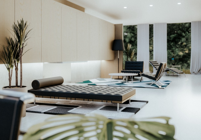
Black and warm wood is the most reliable combination going right now — not because it's trendy, but because it solves something. The warmth of wood stops black from feeling cold; the black stops the wood from feeling rustic. They keep each other honest.
White or off-white against deep navy or forest green works on a similar logic — one surface absorbs light, the other reflects it, and the room has rhythm because of it. Luis Barragán (Mexican architect, author of Casa Gilardi - on the Cover Photo) built entire architectural experiences around this kind of opposition: massive blocks of saturated color against plain white, always tied to how light moved through the space at a specific time of day. He wasn't decorating. He was composing.
Monochrome contrast — light grey against dark grey — is the least obvious choice but sometimes the most elegant. It's almost more about texture than color. Matte plaster next to a polished surface. Rough stone against smooth tile. The eye picks it up even when it can't name it.
Before You Commit To Anything
The biggest practical mistake in renovation is making color decisions in the wrong conditions. Light is the variable nobody accounts for properly. A color you chose under bright store lighting looks nothing like itself on a wall that only gets afternoon sun. Seasonal light changes it further — what works in summer can feel wrong by January.
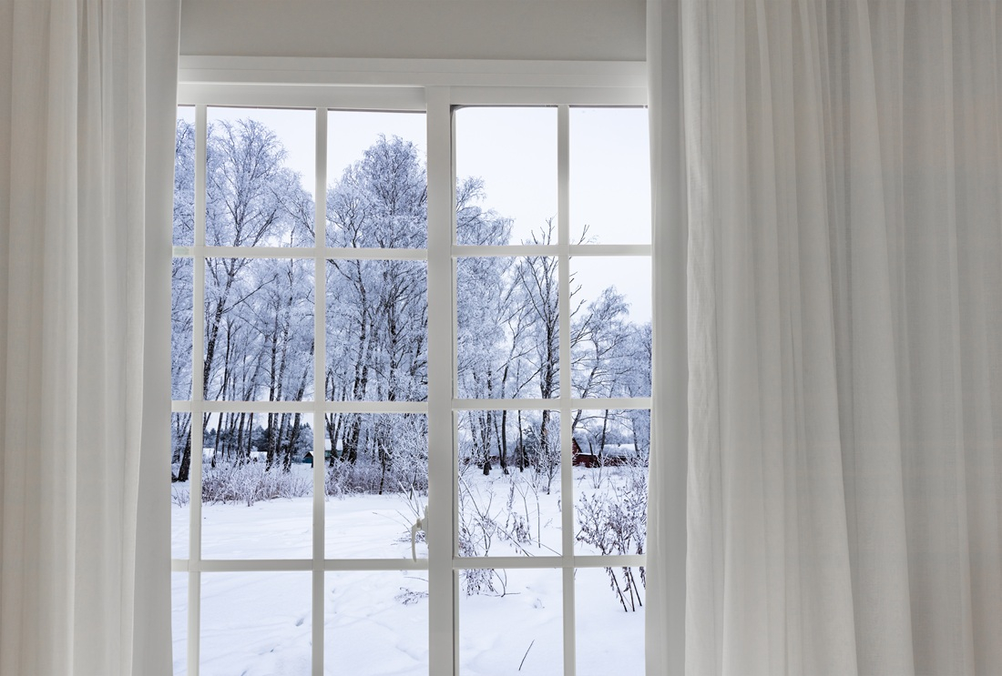
Color temperature compounds this. If your floor is warm oak and your walls are a cool grey, the combination might feel balanced in a south-facing room and slightly off in a north-facing one. That's not a mistake you made — it's just physics. But it's physics you can anticipate if you test things in context rather than in the abstract. Paint samples on a tiny swatch in a bright store tell you almost nothing about how a color will behave on your north-facing bedroom wall in November. Always test on a large piece of cardboard, live with it for a few days, look at it in the morning and in the evening.
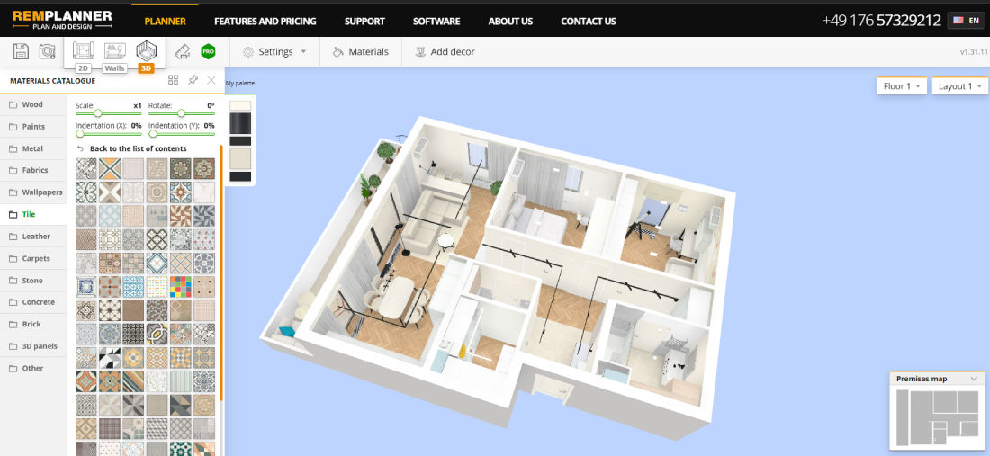
And try to plan the contrast before you start buying materials, not after. The walls and floor and main furniture need to work together — if you choose them separately over several months, you often end up with things that each look fine on their own and don't quite work together. Online planning platform Remplanner is useful here precisely because it lets you lay everything out at once — the floor finish, the wall color, the main surfaces — and the 3D mode means you can actually see how the combination reads in a space rather than just hoping it will.
A room with no contrast isn't restful. It's just absent. There's a difference between calm and blank, between minimal and empty — and that difference is almost always contrast. Not drama. Not color on every wall. Just enough opposition between surfaces for the space to have a shape.
There's a reason some renovated spaces feel finished the moment you step inside, and others feel like they're still waiting for something. It usually has nothing to do with the budget. It has to do with whether the room's elements are actually in conversation with each other — or just coexisting in the same square footage.
Contrast is how you start that conversation. The rest follows.
 Antonella
Marconi